in class exercises
•September 9, 2008 • Leave a Commentface-skull jaws
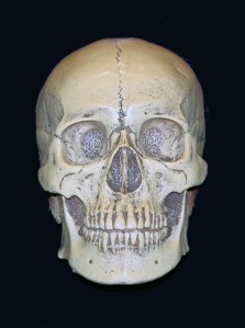
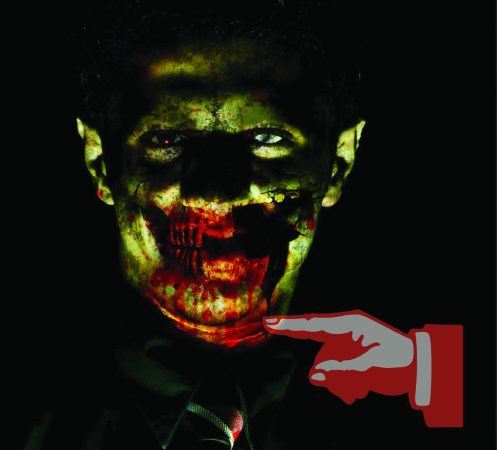
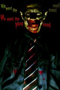
•September 8, 2008 • Leave a CommentWell, to be honest with you, the most vicious and horror part of my work is dealing with the skull used in it. A human skull is used in my work. Just like i explained in previous posts, the image is brought in the photoshop, the parts of it that are not necessary or needed are erased with erase tool and the rest is visible in my work. This is the skull used in my work:
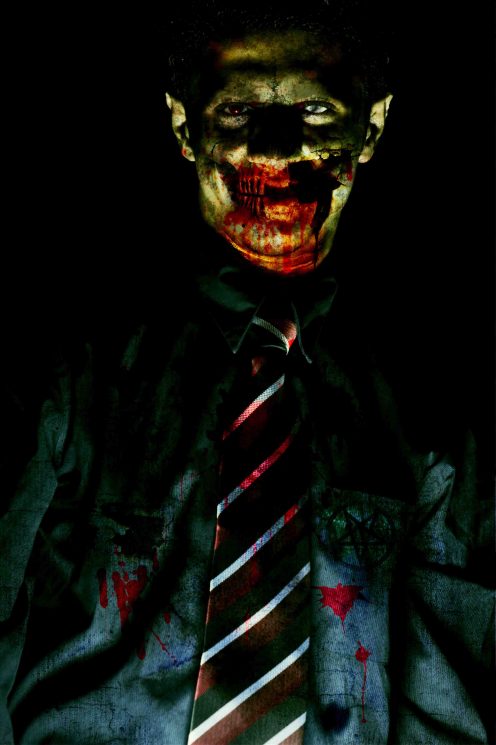
The rest of my work is simply playing around with photo filters, brushes (horror ones downloaded) and their blood splashes on different parts of my image, finally  a satanic logo on my shirt (its brand!) is simply put in on my image.
neck&cheek
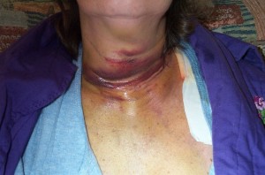
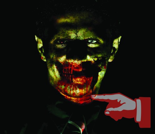
•September 8, 2008 • Leave a Commentas you see my neck is hurt, For showing it hurt like that, i used an image in which the person’s neck was hurt.
What i did was to copy the image and put it in Photoshop, then i deleted the parts i didn’t need, after that i transformed it, enlarge it and make it fit my own neck.
Then for making a part of my face smash, i used another image, it might be hard for you to look at it. its a surgery image.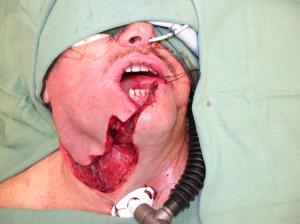

Then what i did was to bring this image to Photoshop and erase every part of it, except the red sliced part. then i went to image>adjustments>photo filter and put a photo filter on it ( a dark one as you see) so it became dark just like a hole on my cheek.
The eyes
•September 7, 2008 • Leave a CommentWell, in first post i want to say what technique is used for making my eyes look horror.
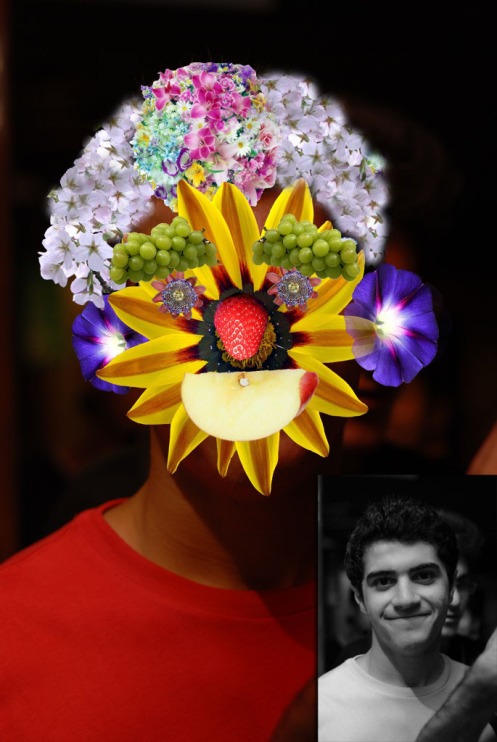
My eye, the left one (when you look at my eye) which is red. I used magnetic lasso tool to select my retina. then i colored it with brush tool. then in image>adjustments>brightness&contrast i increased the contrast and brightness.
My right eye, for whitening my retina (so that it looks as if my eye is blind) i used smudge tool to push white part of my eye into the black part. Then i used dodge tool to whiten it. Finally i used clone stamp tool and used my left eye to make my right eye look more natural. finally if im not wrong i used history brush tool with a very less opacity to make my eye look more natural.
No eyebrow:
For hiding my eyebrows (to make my face more horror looking) i created a new layer and used clone stamp tool and using the skin near my eyebrows to recreate a skin above my image. After that, i used brush tool and eyedropper tool to make it more natural. Next, i used burn tool to recreate dark parts of my face near my eyebrows. Finally, i used history brush tool with a very low opacity to make the whole layer more natural.
Eye scar (on the blind eye):
I used brush tool and with smudge tool i tried to show different parts of it (on my eye, on my eyelash and under my eye) with good perspective.
An important point*
•May 8, 2008 • Leave a CommentI just one to mention a very important point about my global warming poster ideation. What I did was to refuse searching for “global warming” and “global warming poster” in images available on internet. Instead I searched in WEB for “global warming causes” and “global warming effects”.I read causes and effects of global warming and after deciding one of them to be my poster purpose, I thought and came up with the idea on my own. This is REALLY important because as Mr Neo Kian once mentioned in the class, reading stimulates your imagination and makes you think, imagine and consequently CREATE. The reason I didn’t search for images was that after looking at images I could probably be limited to the images and just think and imagine my poster in the very same way and thus had a similar idea to them (increasing inspiration decreases creativity).
Regards,
Shayan Askari 1071118900
Global Warming Poster
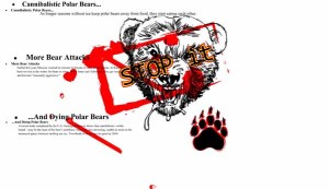
•May 7, 2008 • Leave a CommentWell, this is my final work. Finally after trying several decorations and compositions, I decided this one to be my global warming poster. One point that is made about this poster is that it I tried to UNLEASH my creativity through its content, style and difference with other ordinary and stereotyped global warming posters (always focusing on earth, heat and melting!). I believe it is showing exactly what it is stated in its content. A violent and harsh visualization showing that somehow (polar) bears are very angry and consequently dangerous because of the influence in their life mostly caused by our deeds (global warming). The content is focusing on 3 points:
1. Polar bears eat each other because of the food shortage caused by global warming effect in their environment.
2. Danger of bear attacks (in Moscow); unusual heat has made it hard or impossible for bears to hibernate. When they can’t hibernate they get crouch and “usually aggressive”.
3. Dying polar bears: Thanks to cannibalism (may be the least of the bears’ problems), drowning (being unable to swim in the increased spaces between melting sea ice) and many other problems two third of polar bears will be gone by 2050.
Making of:Bear face
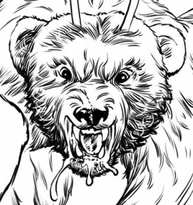
•May 7, 2008 • Leave a CommentWell, I had this image and once I had drown it myself (tracing it-its not my image) . First I decided to simply use live tracing and put the image and its paw in my poster but I found it not only fair but also extremely easy and not challenging. So I decided to use pen tool to draw every detail and line in the bear’s face and its paw. What I did was to firstly open the original image in Microsoft Paint and crop and trim it to remove everything in the image except its face (including those two anonymous horns!).
Making of:Unnatural bear face
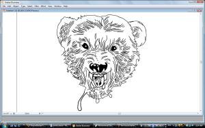
•May 7, 2008 • Leave a CommentThen I placed the image in Adobe Illustrator. But I had already drawn all the details using pen tool in AI (using the original image). Anyway, I found my own tracing image (using pen tool) bare, ugly and unnatural. The reason my image looked unnatural was that it was consisted of only lines and there was no shadow and colors in it.
Making of:improving bear face
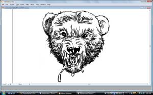
•May 7, 2008 • Leave a CommentSo I decided to live trace the bear head image (cropped image) and put it behind my own bear image to make it look better and more natural. Then I put the live traced image into the symbols palette to decrease its moving speed (every time I wanted to move the live traced image, I had to wait for AI to load the process of live tracing).
Making of:”STOP it”
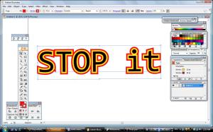
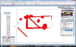
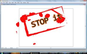
•May 7, 2008 • Leave a CommentAfter finishing working with the bear’s face, I started working on the “STOP it” text. I tried every font available in AI and finally chose one of them. Wanting the text to be more embellished, I added two strokes to it and used yellow and red (warning colors) for them. I wanted my text to be in a red wild rectangle to in order to make it look like a bloody stamp (to make it show violent). So I tried different brushes for my rectangle and finally chose Charcoal Rough brush. And of course choosing red color for it was important.

